
Recently I learned about a style of art known as "Steampunk." I've actually always been drawn to this style (you'd know if you saw my watches or the clock in my house). However, I didn't know it had a name. Even more, I didn't know it was created by artists with such a specific achievement or end-result in mind.
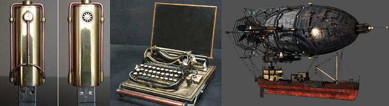
To para-phrase, this style of art is based in Victorian era Britain where steam power is still widely used. Elements of technology or futuristic innovations are added to various Victorian-era items. But not innovations as we know them today, these are innovations as Victorians may have envisioned them. I've included a picture to illustrate, but think H.G. Wells or Jules Verne.
What got me thinking was that this idea isn't far off from how many organizations brand, market and communicate—applying strategies that, to them, seem innovative but are very far off from being successful. The major downfall is that these ideas not only fall short of connecting with people they often paint a more out-dated and out-of-touch picture of the organization.
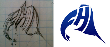
Simple elements like design, wording, symbols and application can convey a great deal about your organization to your audience— especially how in touch you are with what's important to them or relevant in today's world. The simplicity of a logo (mark, type and tagline) can, in a matter of seconds, shape an individual's perceptions of your organization (both consciously and sub-consciously). And to think how many times a logo or branding in general falls from the priority list.
But unlike Jules Verne who didn't mind if his whimsical, over-weight Zeppelin or analog computer ever worked, your organization is relying on effective branding and marketing to convey a particular message/personality that, in turn, will connect with your audience.
If you notice signs that your organization is having an issue with branding or marketing, contact Brand Army or your nearest branding professional—an ounce of prevention is worth a pound of cure :-)
To para-phrase, this style of art is based in Victorian era Britain where steam power is still widely used. Elements of technology or futuristic innovations are added to various Victorian-era items. But not innovations as we know them today, these are innovations as Victorians may have envisioned them. I've included a picture to illustrate, but think H.G. Wells or Jules Verne.
What got me thinking was that this idea isn't far off from how many organizations brand, market and communicate—applying strategies that, to them, seem innovative but are very far off from being successful. The major downfall is that these ideas not only fall short of connecting with people they often paint a more out-dated and out-of-touch picture of the organization.
Simple elements like design, wording, symbols and application can convey a great deal about your organization to your audience— especially how in touch you are with what's important to them or relevant in today's world. The simplicity of a logo (mark, type and tagline) can, in a matter of seconds, shape an individual's perceptions of your organization (both consciously and sub-consciously). And to think how many times a logo or branding in general falls from the priority list.
But unlike Jules Verne who didn't mind if his whimsical, over-weight Zeppelin or analog computer ever worked, your organization is relying on effective branding and marketing to convey a particular message/personality that, in turn, will connect with your audience.
If you notice signs that your organization is having an issue with branding or marketing, contact Brand Army or your nearest branding professional—an ounce of prevention is worth a pound of cure :-)
 RSS Feed